Generalization Predictions
The below sliders illustrate the pattern of generalization predicted as a function of the amount of data observed (N). Male denoted with hats. While it may appear that the model has learned the correct extension for the word with very few data points, this is not necessarily the case. For this visualization, the predictions are fixed to this family tree context. The model might actually make incorrect generalizations on other trees. Refer to Figure 2 in the main paper for how many data points are required for the model to learn the context independent "correct" meaning.
Pukapuka
Kainga

Taina
Matua-tane
Matua-wawine
Tupuna-tane
Tupuna-wawine
English
Mother
Father
Brother
Sister
Grandma
Grandpa
Aunt
Uncle
Cousin
Turkish
Anne
Baba
Abi
Abla
Anneanne
Babaanne
Dede
Hala
Dayi
Teyze
Amca
Eniste
Yenge
Kuzen
Yanomamö
Haya
Naya
Eiwa
Amiwa
Soaya
Yesiya
Soriwa
Suaboya
Pareto-Front
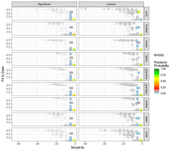
Each hypothesis is plotted according to its fit to the data, or average log likelihood per data point (y-axis), and simplicty, or log prior (x-axis). The hypotheses constituing the top 95% posterior probability at a given data amount are colored according to probability. Hypotheses that denote the correct set of referents in every context are plotted as triangles. The left column tracks the movement of probability over the space if we were to treat each hypothesis as independent. The right column tracks the movement of probability over the space if we were to treat hypotheses as a lexicon (see Appendix C). To start the animation, click on the tree. To reset the animation, click again.